SW 7029 Agreeable Gray is has stood the test of time – it’s a true greige – a marriage of grey and beige and is a bestseller for a reason.
It has a chameleonic quality that pairs well with so many colors. Not cold, not steely but more like melted cappuccino. Warm and ready for any home!
Like Believable Buff, SW 7029 has the ability to be a supporting player instead of the main focus of the room.
When you need a gray that says cuddly not cold, pick SW 7029. If you’re looking for something a tiny bit cooler, check out Repose Gray.
Stay tuned for 3 different color palettes for SW 7029 designed specifically to work with your Cottage, Modern or Rustic style home.
SW 7029 Agreeable Gray Color Values
- CMYK: C-17, Y-16, M-22, K-0
- RGB: R-210, G-203, B-193
- HEX: #d2cbc1
SW 7029 can be used on your walls, cabinets or trim, it’s that versatile. I suggest using a semi gloss or gloss finish on cabinets and trim.
1. Cottage Palette with SW 7029
Agreeable Gray is the perfect color to create a chic updated cottage look. Fireplace wall surrounded by mantel, millwork and bookcases? Color drench the whole thing with SW 7029 and continue painting the trim around walls in it as well. Walls go well in SW 7566 West Highland White. Another option would be to paint the walls in SW 9055 Billowy Breeze and pick out trim in SW 7566.
Add a bit of sharpness with SW 9037 Baby Bok Choy on built in cabinets, islands or a dining alcove. Fabrics that blend this creamy white and springy green will continue and build on the palette. Equally you could use a blue and green mix to layer in these cottage-y colorways.

- SW 7566 West Highland White
- SW 9055 Billowy Breeze
- SW 9037 Baby Bok Choy
2. Modern Palette with SW 7029
The best Modern style embraces mid century with all it’s warm wood tones. Showcase those mid century finds with a deep inky charcoal like SW 9645 Big Dipper. SW 9540 Timber Beam evokes a well worn Barcelona leather chair or a teak sideboard.
Use SW 9645 for window frames, bookcases or cabinets where you want maximum impact. Big Dipper would also make a dramatic interior door color. Try SW 9540 in a study or library. Use this shade to pick flooring or other surfaces like tile
SW 9542 Natural White lightens up dark colors and is perfect for walls.
Agreeable Gray is a great choice for cabinets, doors, walls and trim using the deep colors for accents.
By the way SW 9542, 9645 and 9540 are part of Sherwin Williams new Emerald Designer Edition palette. This paint is available in flat (matte), satin and gloss finish. I always recommend satin finish for walls as it’s more reflective of light and much easier to keep clean! Use satin or gloss finish for trim.
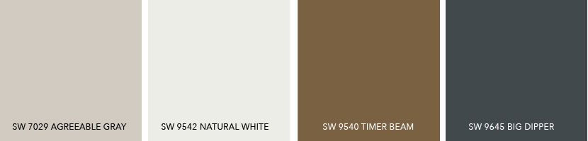
- SW 9542 Natural White
- SW 9540 Timber Beam
- SW 9645 Big Dipper
3. Rustic Palette with SW 7029
Rustic home decor? I see weathered galvanized steel and faded copper barrels with faded barn wood floors.
SW 9552 Antimony evokes galvanized steel that’s been weathered down to the palest color possible – ideal for or a gallery wall, kitchen cabinets or a hall bathroom.
SW 9504 Cold Foam lightens a dark room or use it for kitchen cabinets, master bedroom, hallways. Really any room you want to keep light bouncing around.
Agreeable Gray helps keep the palette weathered, soft and relaxed, like a day in nature. Use it for walls, trim or cabinets.
SW 9006 Rojo Dust can be used anywhere you want to add a touch of heat to the room. It’s like copper that’s been aged by weather and heat – a nice warm accent to other neutrals. Earth tones are back on trend so why not use it on a kitchen island, a guest bath, study, guest bedroom or dining room?
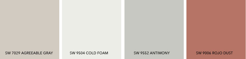
- SW 9504 Cold Foam
- SW 9552 Antimony
- SW 9006 Rojo Dust
Using Your Color Scheme Throughout the House
Choosing a color palette or scheme is the first step in designing any space. Using consistent colors throughout your home makes it feel calmer, more pulled together and intentional.
Why not use these color options to pick wall and flooring finishes like rugs and tile too?
Use your color palette as a guide to choosing furniture too. This goes for curtains or window treatments too. Every time you repeat these colors, whether as a solid (painted wall), a texture (flooring) or a pattern (fabric) you’re making your color scheme work. Your home design will flow and look like it was designed by a pro.
When making those sometimes tough choices about what to buy, what to keep or what to get rid of in your home; use your color palette as your go to decision maker.


1 Comment
Tessa
September 9, 2021 at 9:59 AMA reader recently sent me this question about Agreeable Gray…
“I am writing to you to ask for some help. I love your articles and have found them very helpful.
My dilemma is twofold: Does Agreeable Gray compliment/play well with Balanced Beige?
I was going to paint my hallways and main areas Agreeable Gray (my dining room and sitting room are blues) and my master bathroom is already agreeable gray but I was thinking the bedroom in Balanced Beige … (Is agreeable gray a warm undertone? How do I tell what the undertones are?)”
Both Agreeable Gray and SW 7037 Balanced Beige do have the same warm undertones so can be used together. However because they’re both so close in tone I would consider using a lighter or deeper color for contrast when used close together in the same room or rooms open to each other.
But it’s perfectly fine to use Balanced Beige in a bedroom because it’s a separate space!