What colors coordinate with or complement SW 9130? Sherwin Williams Evergreen Fog is the 2022 color of the year and reminds me a little of Silver Sage. Remember that Restoration Hardware color was super popular at one point because it was so versatile? It was one of those laid back colors that embraced nature and started the trend towards darker colors. Plus it looked expensive and classy!
Evergreen Fog is a deeper green gray but has a similar vibe. Natural, chilled and very versatile. It taps into the trend for deeper colors and steps away from blah neutrals.
You’ll definitely know this color is on your walls but it’s not so dark that it feels oppressive, I’d still be careful about over doing it. Natural light will lighten and brighten it to more like a Silver Sage-y hue but be aware that in artificial light it will go much darker.
SW 9130 won’t fit every interior style, but you can’t go wrong picking it for farmhouse, rustic, country, cabin, cottage or even modern. Oh and let’s not forget traditional and transitional. So lots of room to experiment!
Will this color turn out to be trendy? Who knows. I think it’s timeless enough that you don’t have to worry about changing it any time soon. You may eventually grow tired of it, but then that’s what paint is for. To paint over when you need a change!
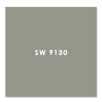
SW 9130 Evergreen Fog Color Values
- RGB: 149, 151, 138,
- HEX: #9597a
- LRV: 30
Evergreen Fog is a chameleon – just like denim, it goes with almost any color. You know what I mean. The undertone and gray-ness of it keeps it neutral and we like neutrals because they’re super versatile!
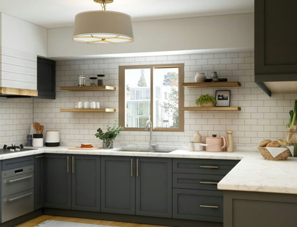
SW 9130 can be used on your walls OR cabinets. This is one of those colors that’s perfect for doors, cabinets or any built-ins. It gives you the depth and pow of the color while keeping your walls free to paint with my suggested white, Snowbound or any of the other accent colors I’m suggesting.
- I suggest using a semi gloss or gloss finish on cabinets and trim, with satin or velvet finish on walls. Even though matte finishes are usually less expensive, I’m not a fan.
- A flat or matte finish can be a pain to keep clean because it shows every single fingerprint and mark. Do yourself a favor and pick a finish with some sheen like Satin. It’s easier to clean plus it lets light bounce and reflect around the room. Win!
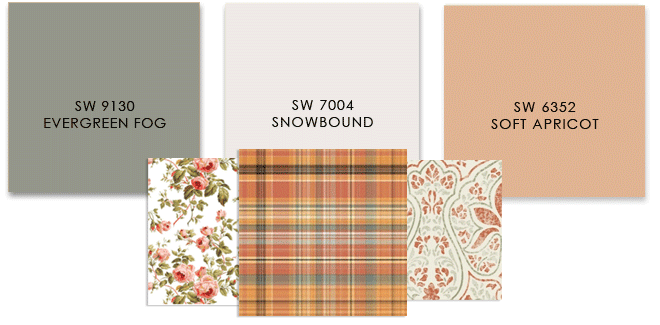
When I pick colors to go with a deep color like SW 9130 Evergreen Fog I’ll always include a white or cream for trim and doors. This time I choose Snowbound SW 7004 which is a neutral white with just enough gray to blend well with SW 9130.
Coordinating Colors for SW9130 Evergreen Fog
I’m suggesting 3 prints for each palette so you can see how to coordinate fabrics and wallpaper with your paint colors. All of these prints can be found on Spoonflower by the way.
WARM RUSTIC PALETTE
For a relaxed, rustic energy I suggest taking a shade like SEQUIN that you’d find in a battered old leather sofa and pairing it with Evergreen Fog. This will create a laid back cozy palette and if you happen to have a leather sofa so much the better! You can make this palette very traditional depending on what patterns you use. Checks or plaids will keep that rustic feel, paisleys and prints lean more to traditional.
COOL MODERN PALETTE
Look how different Evergreen Fog looks next to a cool color like MISTY. It completely changes its aura. This palette would suit modern or even coastal decor, but you could also use it with shabby chic if you choose a pretty toile fabric instead of a geometric. MISTY would be amazing in tile, on a wall, bookcases or cabinets. Super versatile. I would play up textures like chunky throws, nubbly rugs and use velvets or soft textural fabrics to keep things warm and cozy.
NATURAL ORGANIC PALETTE
When you want to keep things naturally chill, Evergreen Fog works well with soft warm neutral colors like DIRTY MARTINI. What a great name! Here’s another opportunity to add lots of texture as an alternative to lots of color. Chunky throws, seagrass rugs, soft muted patterns but in warm textures. DIRTY MARTINI would look great on a wall and won’t dominate a room. SNOWBOUND will keep the two colors from being muddy and blah. With this color palette, you can go organic, plaid, modern or even traditional with your patterns.
ECLECTIC PALETTE
OK so what if you love this dramatic color but you also want to have an eclectic energy in your home? I visualize boho, grandmillenial or your own version of traditional when you pair Evergreen Fog with a warm color like SANDBANK. It’s almost pink but not quite. But let’s face it, if you want your home to feel more feminine this is a great palette. Personally I love to work with green and rose tones and you can have a lot of fun with choosing prints that pick up both.
ROMANTIC PALETTE
OK this palette is for the girl in you! I love the way SOFT APRICOT warms up Evergreen Fog and makes it feel so warm and restful. Traditional, shabby chic, grandmillenial or even maximalist, these colors are feminine without being over the top sugary sweet. Oh and you can have so much fun with picking patterns that you love. But if you choose a plaid or a paisley, the man in your life won’t feel he’s been hit over the head with a girly hammer. In fact I see a nice leather sofa or chair working very well with either of those patterns.
I hope you’re inspired to see how Evergreen Fog can work in your home whatever your design style!
Using a Color Scheme Throughout Your Home
Choosing a color palette or scheme is a no fail first step when designing any space. Color is the glue that holds every room design together. Plus using consistent colors throughout your home will help it to feel calmer, pulled together and intentional. With a dedicated palette, you never have to stop and wonder will this work?
These color palettes work for walls and built-ins, but also for picking other wall and floor finishes such as rugs and tile. Not sure about the tone in a rug sample? Hold it up to the paint swatch and look at it in natural light. Use your paint swatches to pick tile backsplash and bathroom tile. It doesn’t have to match but it should be in the same hue or tint. Don’t worry you don’t have to worry about what that means, just do the natural light test. Take both tile and paint sample outside or in a window with filtered natural light and compare.
Another way you can use your color palette is to choose the color of any large piece of furniture like a sofa or window treatments. Each time you repeat these colors, whether as a solid (painted wall), a texture (flooring) or a pattern (fabric) you’re making this color thing work. Result? Your home will look magazine worthy.
Making those sometimes tough choices about what to buy, what to keep or what to get rid of in your home? Another way to use your chosen colors to decide does this still work or not?
Does this mean you can only use these colors? Of course not! Have fun and use other complementary accent colors in accessories, furniture and flooring.
Still not sure what color is right? A quick affordable solution is my Color Clarity service. Why not try it!


No Comments