What colors coordinate with SW 6142 Macadamia?
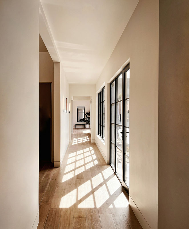
Sherwin Williams Macadamia is a warm deep beige or toast shade.
Macadamia has just enough warmth or red in it to blend in with other warm colors but it’s not overly gold or yellow so you can still use it with grays or other neutrals.
SW 6142 is a Pottery Barn Fall/Winter 2021 color but it resists being considered trendy. I’ve been using it for years!
SW 6142 Macadamia Color Values
- RGB: 204, 183, 155
- HEX: #ccb79b
- LRV: 49
I’m going to suggest specific colors to pair with SW 6142, but honestly this color works with many reds, blues, greens, grays and warm neutrals. It’s that adaptable and easy to use.
SW 6142 can be used on your walls or cabinets. I suggest using a semi gloss or gloss finish on cabinets and trim, with satin or velvet finish on walls. I’m not a fan of matte finishes even though they’re usually less expensive.
A flat or matte finish can be a pain to keep clean because it shows every single fingerprint and mark. Do yourself a favor and pick a finish with some sheen like Satin. It’s easier to clean plus it lets light bounce and reflect around the room. Win!
Using a white or cream in your color palette helps colors like Macadamia feel fresh and clean. Without it they can appear dark, drab and boring. Its essential to always use a little white to break up a color like SW 6142 and any reds, blues, greens and neutrals.
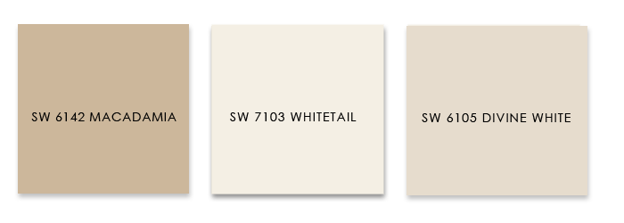
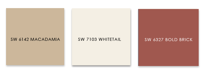
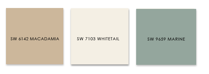
SW 7103 Whitetail is my recommendation for a warm white that coordinates well with SW 6142 these other accent colors. Whitetail is also part of my Denim color palette.
Accent Colors that go with SW6142 Macadamia:
1. Divine White
The perfect palette when you want a very calm neutral room or color scheme. Use Divine White as your wall color, Macadamia as a trim or wall color and Whitetail as your trim or for cabinets.
2. Denim
If you’re looking for a classic color palette that feels a bit nautical or coastal or even preppy! Use Macadamia for a wall color, Whitetail for your trim and Denim for cabinets, a powder room or dining room.

3. Bold Brick
Are you a lover of spicy colors? Or do you live in a warm climate like the desert? Try Bold Brick to warm up the walls in select rooms, use Macadamia on your cabinets and trim and splash in Whitetail to keep things fresh.
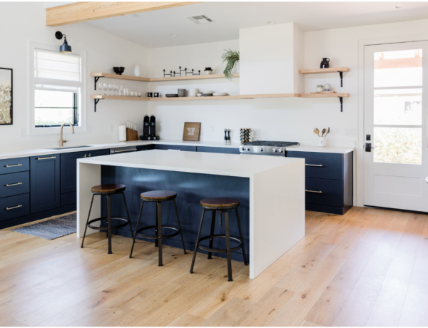
4. Marine
Macadamia pairs well with this Marine, this warm seafoam green. Use Marine on your cabinets, in a bedroom or bath. Use Whitetail on walls, trim or liberally throughout your home to keep this palette light and airy.
5. Fawn Brindle
For a warmer more masculine vibe, pair Macadamia with the gray taupe shade of Fawn Brindle which would also look good on cabinets in a satin finish. I would block these colors out and not mix and match too much.

Using a Color Scheme Throughout your Home
Choosing a color palette or scheme is the first step in designing any space. Using consistent colors throughout your home makes it feel calmer, more pulled together and intentional.
Does this mean you can’t use any other colors? Of course not! Absolutely use accent colors in accessories, furniture and flooring. But keep 2-4 colors as your main go to shades for each room.
These color palettes work when choosing paint for walls, but also when picking other wall and flooring finishes.
- Not sure about the tone in a rug sample? Hold it up to the paint swatch in natural light.
- Use your paint swatches to pick tile backsplash and bathroom tile. It doesn’t have to match but it should be in the same hue or tint.
- Take tile and paint sample outside or in a window with filtered natural light and compare. Both colors should work together, cool to cool or warm to warm.
Your color palette can help you choose other elements like furniture, curtains or window treatments. Every time you repeat these colors, whether as a solid (painted wall), a texture (flooring) or a pattern (fabric) you’re making this color thing work. Your home will thank you!
Use your color palette to decide what stays and what goes!
Still not sure what color is right? A quick affordable solution is my Color Clarity service. Why not try it!


No Comments