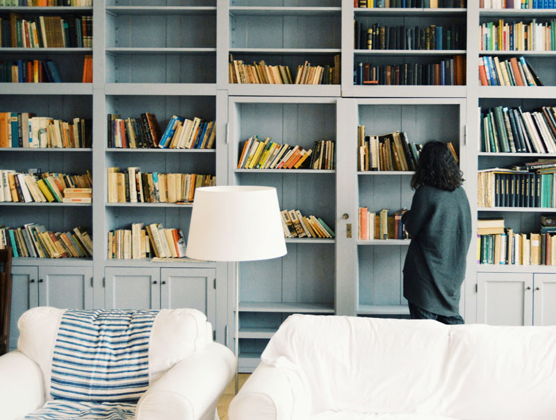
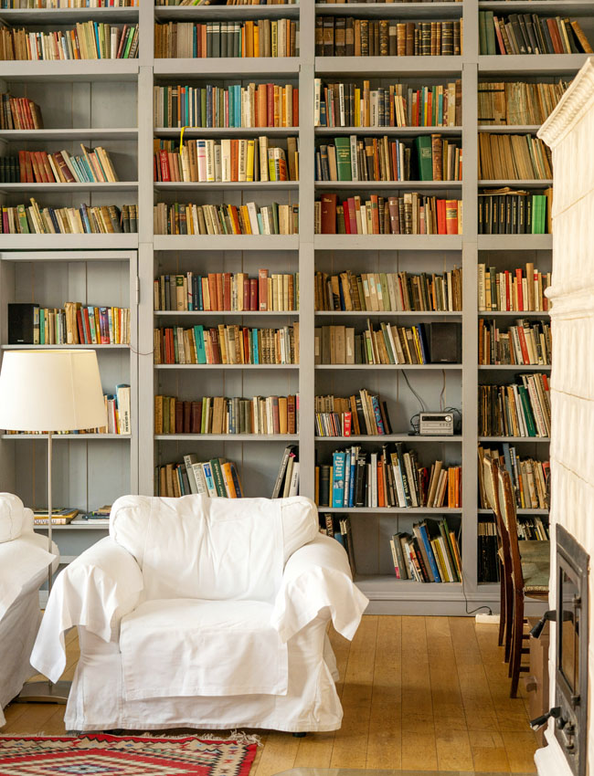
Libraries are the latest interior space to get their own aesthetic nickname, hence “Librarycore”. Akin to cottagecore or grandma chic, librarycore taps into our need for comfort and tradition. It’s about how certain color palettes and decor create that safe and cozy feeling we crave. After all, what’s more traditional than a book!
But you don’t need a library to create a warm inviting space where you may or may not read in a chair by a fire… in fact any study, office or den can be a “library”.
Books are certainly welcome and there’s nothing like a good stack. The stash of ex-library or vintage books that I’d picked up at second hand stores always added a lived in vibe even to new construction.
Should you fake it? Heck no. If you’re not a reader then make your library whatever you want it to be. A place where you can rest and restore. Perhaps somewhere you can practice doing nothing? Create the perfect library with these …
Best Librarycore Color Palettes
In my humble opinion, a proper shade for a library should be deep, enveloping, dramatic and inviting. A tall order! But it should never be cold or say “keep out”. When you open the door, you can’t help but be sucked in and tempted to kick off your shoes and nestle in with a good book right? So let’s get started with BLUES.
1. Moody Blues
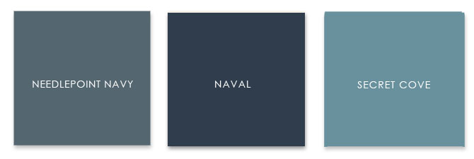
- SW 0032 Needlepoint Navy – a soft denim blue that’s warm and perfect for historic homes
- SW 6244 Naval – this deep bold cool blue needs a crisp creamy white to offset it’s intensity
- SW 9058 Secret Cove – perfect languid green blue for a summer home or cottage library
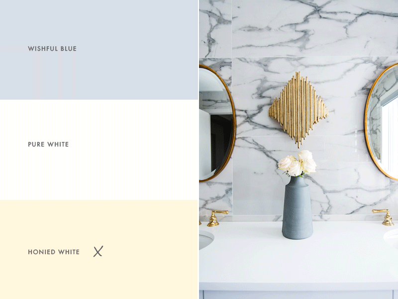
Blue is such a versatile color – it pairs well with cream, white and almost any other shade. After all it is the color of the sky! It can feel warm and dramatic. Just make sure your trim color is a creamy neutral white if you want to keep a cozy library aesthetic in your room.
2. Smoky Greens
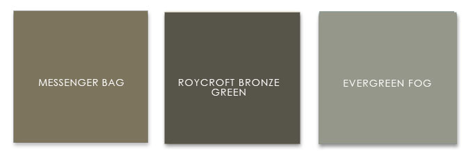
- SW 7740 Messenger Bag – just barely green, it’s gray undertone pairs well with creamy Dover White
- SW 2846 Roycroft Bronze Green – picture this rich mossy hue in a Craftsman bungalow
- SW 7130 Evergreen Fog – another green that thinks it’s gray, yet warm and calming at the same time.
These rich earthy greens are bound to make a statement. See how each color is both neutral yet warm? You can pair these leafy shades with a white that’s just this side of warm. SW 6385 Dover White or SW 7012 Creamy are good examples.
3. Rustic Reds
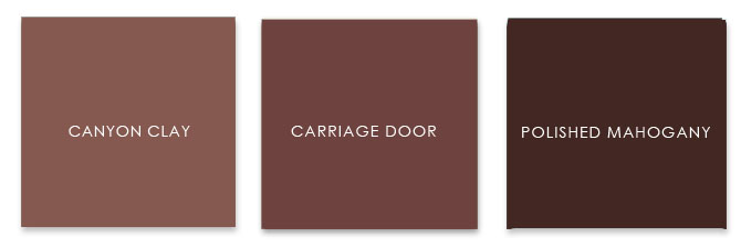
- SW 6054 Canyon Clay – perfect for the desert but warms up a cold climate too. Calm with just a hint of red.
- SW 7594 Carriage Door – deep warm plummy brown reminiscent of a faded barn door
- SW 2838 Polished Mahogany – intense rich dark chocolate with a red undertone
When you want to go bold, it doesn’t get much more dramatic than these dark reds which lean towards brown. They’re warm, yet neither feminine or masculine. Again I would paint trim in a Dover or Creamy to lighten these deep shades and keep them warm not oppressive. That’s a lot of color!
Paint Finish Options
A flat or matte finish can be difficult to maintain as it has a tendency to show every single fingerprint and mark. However in a library you certainly could get away with it. A matte finish will soften the bolder colors and help them feel more modern – even as you pile on the traditional home decor!
Choosing a finish with some sheen such as eggshell can be easier to clean that matte and it allows light to bounce and reflect around the room thereby infusing the color with a different personality depending on the day! A good choice if you’re concerned about your library being too dark.
I suggest Modern or Estate eggshell finishes on cabinets and trim for a matte look that has ease of use and wearability.
Using a Color Scheme Throughout Your Home
Choosing a color palette or scheme is the first step in designing any space. Using consistent colors throughout your home makes it feel calmer, more pulled together and intentional.
Does this mean you can’t use any other colors? Of course not! Use accent colors in accessories, furniture and flooring. But keep 2-4 colors as your main go to shades for each room.
Color palettes are great for choosing paint for walls, but also to pick other wall and flooring finishes.
Not sure about the tone in a rug sample? Hold it up to the paint swatch in natural light. Pick tile the same way. It doesn’t have to match but it should be in the same hue or tint.
NATURAL LIGHT TEST: Don’t worry if you’re not sure what that means, just do the natural light test. Take both tile and paint sample outside or in a window with filtered natural light and compare. You want both colors to work together, cool to cool or warm to warm.
Use your color palette when choosing the color of any large piece of furniture like a sofa too. The same is true for deciding on curtains or window treatments. Every time you repeat these colors, whether as a solid (painted wall), a texture (flooring) or a pattern (fabric) you’re creating harmony in your home through color.
Your palette can also be a decision maker when making those tough choices about what to buy, what to keep or what to get rid of!
Still not sure how to know the color is right for your home? Take a look at my Color Clarity service. Let me know if you have any questions in the comments below or get in touch!




No Comments