
Let’s find out what the best Sherwin Williams Crisp Linen coordinating colors are.
If your home’s trim or cabinets are already painted in Sherwin Williams “Crisp Linen”; I’m suggesting these 4 palette options. So these are good options if you’re struggling to pick a color match.
What to Consider Before Using SW6378 Crisp Linen
Considering whether or not to use Crisp Linen? Unless you want a very warm and peachy white, I’d suggest SW 7012 Creamy instead.
- SW 6378 Crisp Linen is a very warm white with a pale tan hue and has a definite pinkish undertone as well as yellow which means it can easily look peachy. SW 6378 has no cool tones. Any harmonizing colors should be warm with corresponding red or yellow hues.
- Crisp Linen can throw a pinkish yellowy cast over the room so when choosing lighting and flooring keep that in mind too. Try to avoid any cool tones (blue or black) in stone, wood or tile flooring and use light bulbs that are pure or warm white. Lampshades or light covering scan also throw off a lightbulb color so consider keeping those in warm tones.
- Crisp Linen can be used as trim paint, cabinet color or wall color. If your home’s trim is painted in SW 6378, use one of these accent colors for walls or cabinets to keep your color scheme warm and lively without clashing with Crisp Linen’s peachy side!
Crisp Linen Coordinating Color Palettes
A. MONOCHROMATIC

Irish Cream and Believable Buff will work as a wall color with Crisp Linen as the trim.
SW 6120 Believable Buff is a versatile neutral: here’s several other coordinating palettes that work with this popular tan shade.
SW 7537 Irish Cream is a little lighter than Believable Buff but a shade or two darker than Crisp Linen. Perfect for picking out Crisp Linen trim; use it on the bottom half of wainscotting or inside a bookcase shelf for example. When you want to keep your room neutral or monochromatic but crave a little something extra, Irish Cream will play happily alongside Crisp Linen.
B. COASTAL

These two coastal inspired colors Salt Spray and Eventide will add a touch of elegance and a beachy vibe to a Crisp Linen trimmed room. I consider these warm cool colors.
SW 9651 Salt Spray. Very sophisticated and on trend and oh so versatile. This neutral version of seafoam green never goes out of style.
SW 9643 Eventide. A deeper gray green shade that will cool down some of the pinky tones of Crisp Linen.
Have fun decorating with woven accents, off whites with patterns of gray, even using deeper shades of these sea shades in your glassware or pottery. Either of these gray/green colors would look fabulous on walls using Crisp Linen for trim or cabinets. Use inside a bookcase to add depth or on cabinets. Eventide will also work well as a wall color in a guest bath, powder room or study.
C. WARM

Consider these two warm colors as accents to add spice and contrast to the neutral Crisp Linen. Depending on your color preferences, Chrysanthemum or Bakelite Gold can be used in small amounts in a powder room or bath wall. Or if you live in a cold climate and want to add some visual heat, by all means experiment with using them in a kitchen, den or study.
SW 6347 Chrysanthemum is a soft deep terra cotta that would work well on cabinets alongside Crisp Linen or even a deeper color like Mindful Gray. Use it wherever you want to cozy up a space. Perfect for an accent wall!
SW 6368 Bakelite Gold is best used in small spaces like a powder room, guest bedroom or inside a cabinet painted in either Crisp Linen or Chrysanthemum. Can’t you just see burnished gold hardware with this!
Both of these “hot” colors work well with the cooler Salt Spray and Eventide as well as SW 6378 Crisp Linen. In fact they all play well together. How you mix and match them is up to you.
For example, use the “spicy” colors in fabrics, throws and pillows instead of paint. Try painting an accent piece of furniture such as a chest of drawers, end table or console table and watch your room light up.
D. TRADITIONAL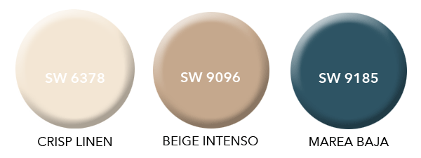
Sherwin Williams features these as coordinating colors to Crisp Linen. In my mind they represent a very good traditional or more masculine color palette. Darker and more intense, neither of these colors would work well with my other choices but I include them here in case you’re looking for a deeper richer look.
SW 9096 Beige Intenso could be used on the bottom half of a wall, as an accent wall or on cabinetry.
SW 9185 Marea Baja, a deep teal blue works for cabinets, on an accent wall or on accent pieces of furniture. Don’t forget either of these colors can be used in your accessories, fabrics and pillows.
The Whole House Color Scheme
Choosing a color palette or scheme is the first step when designing any space. Using consistent colors throughout your home makes it feel calmer, more pulled together and intentional. You never have to stop and wonder… what do I do now?
My advice is to not only use these color palettes for your walls, but also to pick wall and flooring finishes like rugs and tile.
- Not sure about the tone in a rug sample? Hold it up to the paint swatch and look at it in natural light.
- Use your paint swatches to pick tile backsplash and bathroom tile.
- Use your color palette as a guide to choosing the color of furniture like a sofa. Same with curtains or window treatments.
When making those sometimes tough choices about what to buy, keep or toss, your palette can help you decide.
Download FREE Crisp Linen Color Palettes PDF


No Comments