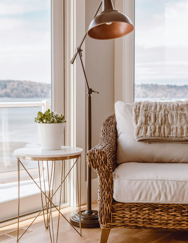
SW 9109 Natural Linen is a perfect shade to pull off your Granny Chic or Grand Millennial style. It has all the cozy familiarity of your gran’s but is updated with just the right touches of whimsy and bold color.
One of the most popular Sherwin Williams neutrals, Natural Linen is considered a “yellow” but it has more of a pinkish undertone to it. Don’t stress too much about the tone, just know that it’s not too cool or too warm. Which is what makes it that perfect neutral!
Please don’t get SW 9109 Natural Linen confused with Benjamin Moore Natural Linen – they’re two ENTIRELY different paint colors.
When to Choose Natural Linen
Choose Natural Linen when you want a little more ooomph than white or cream but you still want to keep things neutral.
If you want to keep the walls warm and instead use bolder color in your furnishings, wall art and fabrics then this is the shade for you.
SW 9109 is super versatile and works with both cooler and warm colors.
Now try out these elements of “Granny Chic” in your home!
Natural Linen Colors for a Granny Chic Vibe
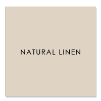
- R:223 G:211 B:195
- Hex Value:#dfd3c3
- LRV:66
Below are 3 options for a color palette using Natural Linen as the “main character”.
With each color option, I’ll also show you 3 prints that would work well with Natural Linen. This is how to coordinate fabrics OR wallpaper with your chosen palette. You won’t get tired of Natural Linen and that’s a huge plus.
I found all of these prints on Spoonflower by the way!
Natural Linen with “Denim”
SW6523 Denim
I’ve written about Denim before and it’s a nice neutral blue that works so well with other neutrals – those colors that are neither warm or cool.
This deep soft blue is a natural for Granny Chic home decor as there are so many traditional patterns, such as Toile and chinoiserie (patterns inspired by Chinese and Asian china) with blue as the main color. Blue is such a versatile color because it goes with almost any other color. Well natch, it’s the color of the sky!

Pair SW 9109 Natural Linen with SW 6523 Denim + Pattern Options
How to use Denim in your home
- Have you got some beautiful Blue Willow china you’d love to display?
- How about a favorite toile fabric for curtains or a pillow or two?
- Try denim fabric with a ruffle or pleat on a pillow, chair or ottoman
Natural Linen with “Haven”
SW 6437 Haven
A soft green is the perfect foil to sharpen and add contrast to the creaminess of Natural Linen. Haven reminds me a little of a crisp green apple. It also works with Denim so feel free to combine these two when using Natural Linen. If you’re a green/blue freak like I am you’ll love this combo!
As you can see by the patterns, it’s so easy to pair blue, green and even pink together with SW 9109. Make your home as pretty and feminine as you like or keep it a little more masculine by leaving the pink/peach for the bedroom and baths.

Pair SW 9109 Natural Linen with SW 6437 Haven + Pattern Options
How to Use Haven in your Home
- Well first of all if you some house plants, bingo, you’ve already got the right shade
- Look for leafy prints and mix and match with stripes and checks
- Love this shade on furniture – wouldn’t it be perfect on a desk or cabinet!
View this post on Instagram
Natural Linen with “Blushing”
SW 6617 Blushing
Don’t you just love this color! What a sweetie. Now if you want to create a very soft feminine space, this color will work wonders. It perks up Natural Linen and brings out the warm colors of a polished wood floor or even Saltillo tile. If you want to cut the sweetness a tiny bit, use Haven to add a bit of acidity to the color mix.
Another shade to turn SW 9109 and Blushing a bit more masculine and neutral would be a soft neutral like Mindful Gray. Can you see it?

Pair SW 9109 Natural Linen with SW 6617 Blushing + Pattern Options
How to Use Blushing in your Home
- Let’s paint the powder room for starters, this color is SO flattering!
- How about the inside of bookshelves or a cabinet?
- Don’t forget painting the ceiling if you’re feeling a little daring
View this post on Instagram
Using a Color Scheme Throughout the House
The first step to designing your space is choosing a color palette. Using consistent colors throughout your home makes it feel calmer, more pulled together and like you meant it!
Once You’ve Chosen a Color Palette:
- Use your colors for your wall color, but also for other wall and flooring finishes like rugs and tile. Not sure about the tone in a rug sample? Hold it up to the paint swatch and look at it in natural light.
- Use your paint swatches to pick tile backsplash and bathroom tile. It doesn’t have to match but should be in the same hue or tint. Don’t worry you don’t have to worry about what that means, just do the natural light test. Take both tile and paint sample outside or in a window with filtered natural light and compare.
- Use your palette as a guide to choosing the color of furniture like sofas. Same with curtains or window treatments.
- Every time you repeat these colors, whether as a solid (painted wall), a texture (flooring) or a pattern (fabric) your palette is working for you
- Use your palette as a decision maker when making those sometimes tough choices about what to buy, what to keep or what to get rid of in your home.
Still not sure what color to choose for your home? A quick affordable solution is my Color Clarity service.


No Comments