What colors complement SW 7015 Repose Gray? Here’s 4 different color palettes to choose no matter what your style is.
Sherwin Williams Repose Gray is similar to Agreeable Gray SW 7029. It’s also a very neutral gray beige or Greige.
Choose Repose Gray because:
- it’s a tiny bit cooler than Agreeable Gray (without the pinkish undertone)
- you need a super neutral warm gray that won’t clash with other cool or warm colors.
- it coordinates well with greens and golds
You can’t beat a nice neutral pale gray. It’s like jeans, it goes with everything without making a big fuss about it. Gray is the chorus, not the lead singer and that’s the way it should be.
Like the popular Believable Buff, a lack of trendiness and ability to be a supporting player instead of the main focus of the room is it’s charm.
When you need a gray that’s warm and versatile and not picky about how you use it, pick SW 7029.
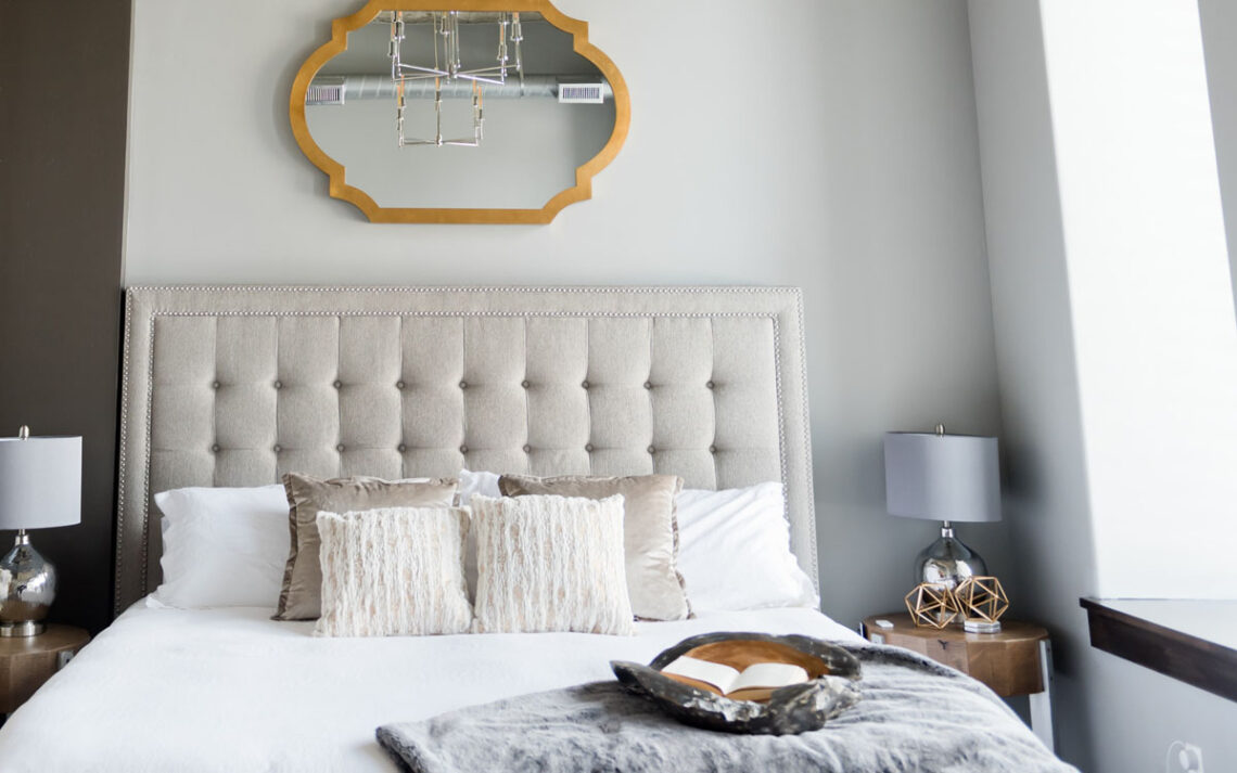
SW 7015 Repose Gray Color Values
 SW 7015
RGB 204 | 291 | 192
HEX #ccc9c0
SW 7015 can be used on your walls, cabinets or trim, it’s that versatile. Color drench and do all three. I suggest a semi gloss or gloss finish on cabinets and trim, satin or velvet finish on walls.
Flat or matte finish is a nightmare to keep clean and shows every single fingerprint and mark. Do yourself a favor and pick a finish with some sheen like Satin. It’s easier to clean and lets light reflect around the room. Win!
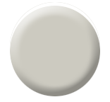
1. Minimalist Palette
Minimalist design style calls for monochromatic tones like Repose Gray.
Use SW 7015 for walls, cabinets and trim. In fact color drench or wash the color over both walls, cabinets and trim for a truly minimalist pared back look. If you like the look of a white kitchen with marble, pick SW 9541 White Snow for cabinets with SW 9691 Crystalline on walls or a dining space. Nice soft color for bedrooms as well.
SW 9595 Braintree is a deep gray brown. Think a dark floor in that shade or a kitchen island accent color. How about office bookcases or built ins for a bit of drama.
- SW 9541 White Snow
- SW 9691 Crystalline
- SW 9595 Braintree
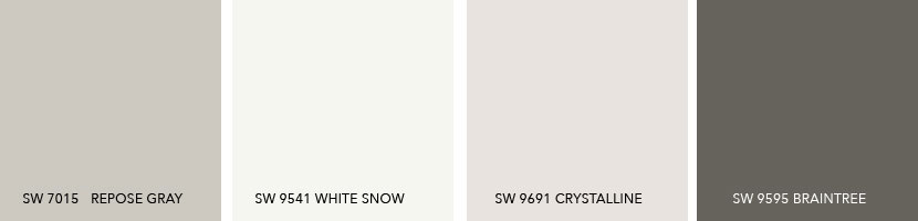
2. French Country Palette
Repose Gray is the perfect soft gray to set the stage for a fabulous French country estate look. You know those wonderful French linens with the stripes? Westhighland White with Repose Gray stripes. Or SW 7601 Dockside Blue with SW 7566 White stripes!
SW 7015 Repose Gray would be very soft and effective on your kitchen or bathroom cabinets. I see SW 7566 on walls to keep it feeling light and airy. SW 7601 Dockside Blue is that quintessential dusty French blue. Use it on doors, furniture, cabinet work or a bathroom.
SW 7601 can also be your guide when choosing fabrics for chairs, cushions and bedding. Get the shade right but mix it up with patterns, stripes and textures. Same goes for SW 9120 Tumblin Tumbleweed.
SW 9120 represents wood floors, grain sacks and weathered woodwork. Use it as a guideline for choosing flooring like wood, sisal or carpeting.
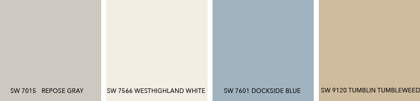
- SW 7566 Westhighland White
- SW 7601 Dockside Blue
- SW 9120 Tumblin Tumbleweed
3. Beach House Palette
Even if you live miles from the sea, it’s fun to replicate a beach house vibe? My home is peppered with sailboats and shells. My own bit of coast!
Repose Gray is the perfect base color to keep those blues, greens and whites from looking too floaty. Think of it as the ground, beach, sand or dune. Use it to paint a funky wood floor that you don’t want to sand down. Visualize it as a durable slipcover for a sofa or chair. Use it as part of a pattern in a rug that also has blues and whites in it.
SW 9503 Cheviot can be painted on walls, cabinets or trim or all of the above. If you want that really whitewashed look, go for it. Paint Repose Gray on old cabinets and use Cheviot to add a distressed white wash finish.
SW 9144 Moonmist and SW 9057 Acquitaine can add a refreshing splash to bathroom, bedroom or even kitchen walls. Keep cabinets and trim painted white for a classic beach house aesthetic.
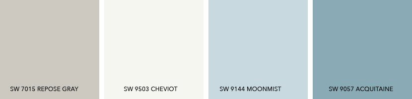
- SW 9144 Moonmist
- SW 9503 Cheviot
- SW 9057 Acquitaine
4. Shabby Decor Palette
Versatile Repose Gray is a lovely neutral base to indulge your love of shabby decor. It looks absolutely perfect on bathroom cabinets, trim and doors while SW 8917 Shell White can be rolled on walls, kitchen cabinets or trim.
What lifts both those neutral colors into shabby distressed heaven are the seafoam green of SW 6477 Tidewater and SW 9692 Cotton Candy. Two colors would be too sweet on their own, but Repose Gray and Shell White keep it sugar-free.
By all means use Tidewater or Cotton Candy on walls but with a light touch. Perfect for child’s bedroom or bathroom!
Tables, chairs and dressers can be painted in any of these colors. With a palette like this, mix and match all the colors and they still work.
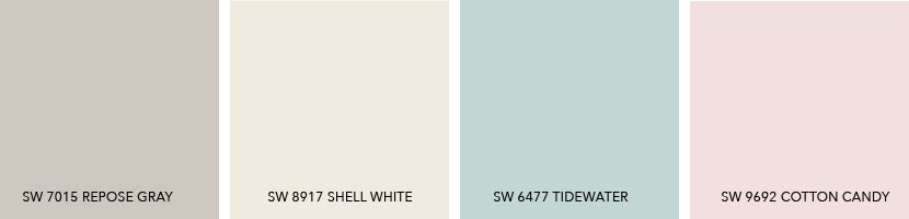
- SW 8917 Shell White
- SW 6477 Tidewater
- SW 9692 Cotton Candy
Use a Color Scheme Throughout
Choosing a color palette or scheme is the first step when designing any space. Using consistent colors throughout your home makes it feel calmer, more pulled together and intentional.
My advice is to use these color palettes for your walls, but also use them to pick other wall and flooring finishes like rugs and tile.
Use your color palette as a guide to choosing the color of any large piece of furniture too. Same with curtains or window treatments. Every time you repeat these colors, whether as a solid (painted wall), a texture (flooring) or a pattern (fabric) you’re making this color palette sing!
A color palette is your go to decision maker when making those sometimes tough choices about what to buy, what to keep or what to get rid of in your home.


No Comments