
If you’re wondering what colors coordinate with SW 9109 Natural Linen here’s two color palettes to try.
Want a designer look? Use coordinating colors throughout your home.
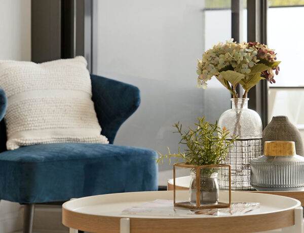
Sherwin Williams Natural Linen is a warm neutral that’s super versatile. Although it’s considered a “yellow”, SW 9109 has more of a pinkish undertone to it. But it’s definitely neutral, not too cool or too warm.
Don’t confuse SW 9109 with Benjamin Moore Natural Linen – they’re two different shades.
It’s no secret the top selling paint shades are all neutrals. Natural Linen is a neutral that makes more of an impact than white or cream, but doesn’t overpower the room!
Natural Linen or Accessible Beige?
Accessible Beige SW 7036 is another top seller and I’ve used it many times. It’s that perfect shade – not too beige/brown – warmer than a gray.
Natural Linen is a shade lighter than Accessible Beige; a little creamier and without the grayish undertone of Accessible Beige which makes it more of a greige.
What does this mean? Pick Natural Linen if you want a lighter creamier beige that’s a little more modern. And versatile. Pick Accessible Beige if you want a slightly deeper color or you’re trying to match existing flooring.
What Colors Coordinate with SW 9109 Natural Linen?
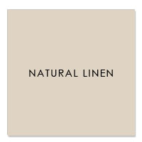
- SW 9109
- R:223 G:211 B:195
- Hex Value:#dfd3c3
- LRV:66
- What’s the undertone of SW 9109? Mainly yellow + pink undertones.
- What paint color is a shade darker than Natural Linen? Accessible Beige
One of the advantages of Natural Linen is how it goes so well with different design styles. It’s kind of like a chameleon. So try these coordinating colors for SW 9109 in your coastal or farmhouse design style or most other styles too. Let’s go!
Coastal Color Scheme
Natural Linen is a perfect match for coastal style – doesn’t it remind you of sand, driftwood and bleached floors? You can’t help hearing the call of the waves! To bring out the beachy side of Natural Linen use these coordinating colors.
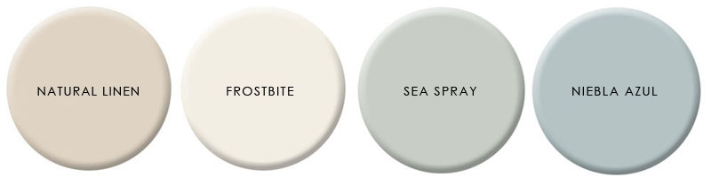
SW 9505 Frost Bite is the perfect shade of white to use on trim, cabinets or wherever you want to lighten and brighten.
SW 9651 Sea Spray brings the outside in and reminds us of waves, surf and skies.
SW 9137 Niebla Azul is warm grayish blue that’s perfect for a deep accent wall, furniture or fabric
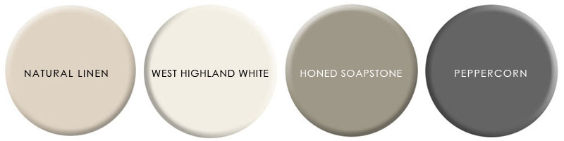
Modern Color Scheme
Want to keep it cool and neutral – either with a modern build or to get a Scandi feel?
The trick is using a deep dark color to contrast with the neutral linen color.
SW 7566 West Highland White is a crisp clean warm white that’s very easy to pair with neutral shades.
SW 7674 Peppercorn is one of the most popular SW colors and the perfect charcoal for trim, doors and cabinets, or above wainscoting.
SW 9126 Honed Soapstone is in the SW Pottery Barn Collection and has a great organic feel. Although it’s a deep olive, it’s warm and lively. Ideal for a study wall, cabinets, trim or accent.
How to Use a Color Scheme
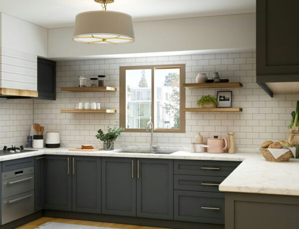
Choosing one of these color palettes or schemes is the first step in designing any space. Using consistent colors throughout your home makes it feel calmer, more pulled together and intentional. You never have to stop and wonder what do I do now?
Does this mean you can’t use any other colors? Of course not! Absolutely use accent colors in accessories, furniture and flooring.
Use these color palettes for your walls, but also use them to pick other wall and flooring finishes like rugs and tile. Not sure about the tone in a rug sample? Hold it up to the paint swatch and look at it in natural light. Use your paint swatches to pick tile backsplash and bathroom tile.
Use your colors as a guide to choosing the color of any large piece of furniture like a sofa. Same with curtains or window treatments. Every time you repeat these colors, whether as a solid (painted wall), a texture (flooring) or a pattern (fabric) you’re making this color thing work. Your home will thank you.
Use your 4 color palette as your go to decision maker when making those sometimes tough choices about what to buy, what to keep or what to get rid of in your home.


No Comments