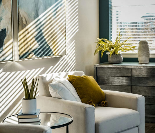
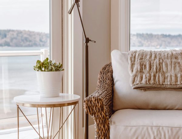
Which colors go best with Upward SW 6239 by Sherwin Williams? Let’s find out!
Upward is the Color of the Year for 2024 – it’s a pale almost ethereal grayish blue and one of those very obliging colors that naturally makes any room feel lighter and airier.
Blue’s a personal favorite of mine and as there’s so many shades and nuances to blue I think everyone can find a shade they love. Not only is it the color of the sky and water but it pairs well with almost every other color.
SW 6239 is like that super faded pair of jeans you just can’t let go of.
Upward is quite a neutral blue, it’s not warm (like a turquoise for example) or overly cool. It almost feels like a gray with a hint of blue in it.
Which means it will fit in a lot of places that need a bit of a lift. You don’t have to worry too much about it clashing with another color!
I honestly can’t think of a room that couldn’t benefit from Upward’s light airy feel.
Try these looks in your home…
Which Colors Go Best with Upward SW 6239?
The coordinating white I recommend with Upward is Snowbound. Use it on trim, doors, cabinets or wainscotting. A “pop” of white always makes other colors in the room seem fresher and brighter.
The more white you add, the lighter and brighter your other colors will feel. Less white and your room will feel darker and moodier.
A. Soft Neutral
For a versatile vibe? This palette works for any architectural style.
- SW 6239 Upward
- SW 7004 Snowbound
- SW 9097 Soft Fawn
Upward is a cool neutral blue with gray undertones. Snowbound stays in the same neutral family, not too cool or warm, so feel confident in using it for your trim, cabinets or anywhere you want to brighten Upward.
Soft Fawn takes that one step further. Think of it as a warm sisal rug or even a wood floor. It balances out the cool blue of Upward and warms everything up. Use it in on study walls, home office, on cabinets or even the floor if you like painted floors.
This palette is a perfect combo for any home style that you want to keep fresh, modern and warm. For your hardware I’d choose gold or bronze with this palette.
B. Cool Modern
For a modern home, office or new build where you want the paint color to stay in the background.
- SW 6239 Upward
- SW 7004 Snowbound
- SW 7669 Summit Gray
You can’t go wrong with using Summit Gray with Upward. It balances out the airiness of Upward and grounds it. Now this may seem boring, but if what you’re looking for is simplicity, then give this palette a go.
Don’t be afraid to throw in your favorite warm colors (gold, red, even orange) in accessories, flooring and furniture and this color combo will sit back and let them shine.
Use Summit Gray on doors, cabinetry, kitchen cabinets and trim. Pick gold hardware to warm it up, silver to keep it cool.
C. Soft Organic
Our favorite moody Evergreen Fog, brings nature inside wherever you live!
- SW 6239 Upward
- SW 7004 Snowbound
- SW 9130 Evergreen Fog
Perfect palette for your beach house or if you want your home to feel like you’re by the coast! Lots of versatility here to mix up these two colors. Evergreen Fog for cabinetry and doors, even a bath or study if you want to keep it moody. Toss it on a bedroom wall with lots of light bedding and hardwoods.
I can visualize elements like seagrass, natural wood and a beachy vibe with this palette!
I’d recommend either gold or neutral silver hardware for this palette.
D. Historic
This more unusual color combo would fit well in your modern Victorian home or take on a feminine vibe.
- SW 6239 Upward
- SW 7004 Snowbound
- SW 9080 Hushed Auburn
I wanted to go a little out of the box with this one. Here’s what I’m visualizing.
Pale pale denim (Upward) with rosy neutral (Hushed Auburn) velvets or wools. Doesn’t that sound lush? Throw in some sheepskin throws and polish it up with rose gold or burnished gold hardware.
Add some deep mahogany or rosewood furniture or flooring and you’ve got a stunning, dare I say it, sexy backdrop that will feel cozy and modern. The best of all worlds! Think of this as a more mature palette for those spaces you’ve been longing to create.
I hope these palettes inspire you to use Upward in your home – have fun with it!
Which Paint Finish Should You Use?
- Semi gloss or gloss finish on cabinets and trim
- Satin or Eggshell finish on walls.
- Matte only on ceilings or areas with very low traffic
- Flat or matte finish is a pain to keep clean because it shows every single fingerprint and mark.
- Sheens like Satin or Eggshell are easier to clean and let light bounce and reflect around the room.
Color Palette Tips:
- Use your palette to pick other finishes such as RUGS and TILE and HARDWOODS.
- Not sure about a rug sample? Hold it up to your paint swatch in natural light.
- Same for tile backsplash and bathroom tile. It doesn’t have to match but it should be in the same hue.
- Use your palette to help choose furniture and window treatments.
- Trying to decide what to keep or get rid of? Use your palette! Does it fit or not.
- Repeat these colors, whether as a solid (painted wall), a texture (flooring) or a pattern (fabric) throughout your home for a professional touch!
Why a Palette Works
Choose a color palette as your first step because when you use consistent colors throughout – your home feels calmer and more intentional.
With a palette, you’ll never have to stop and wonder … um does this go? You know.
Does this mean you can only use these colors? Of course not! Have fun and use other complementary accent colors in accessories, furniture and flooring.
Still not sure what color is right? A quick affordable solution is my Color Clarity service. Why not try it!


No Comments