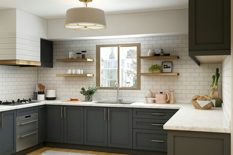
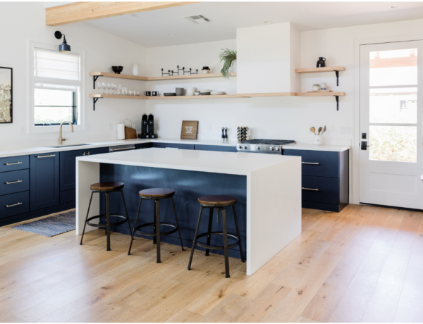
Deep rich kitchen cabinet colors are hot for a reason. With open living, painting the kitchen cabinets a dark hue makes them feel more like furniture and less like kitchen cupboards.
A deep rich color on your kitchen cabs also helps define the space and creates a dramatic focal point.
Is dark and cozy wrong in a smaller separate kitchen space? Nope. Although I’d be more intentional about it. For example try painting just the base cabinets or an island in the dark dramatic paint color vs the entire kitchen. It all depends on how much light you have coming into the room and what your personal preference is. Some of us like light and bright and others are happy with deep and dark.
Prints and Patterns to Match Paint Colors
But wait – what about coordinating colors, prints and patterns?
I’ve handpicked these prints to pair with each color. Use fabric prints on window coverings, bar stools, bench or chair cushions or a wallpaper pattern to add interest to walls.
Got an open plan kitchen dining space? Then continue the coordinating with these print ideas on window coverings, upholstered chairs, and pillow covers throughout your space to tie the kitchen and living spaces together. Easy peasy.
Below find three favorite dramatic paint colors from Sherwin-Williams to transform your kitchen.
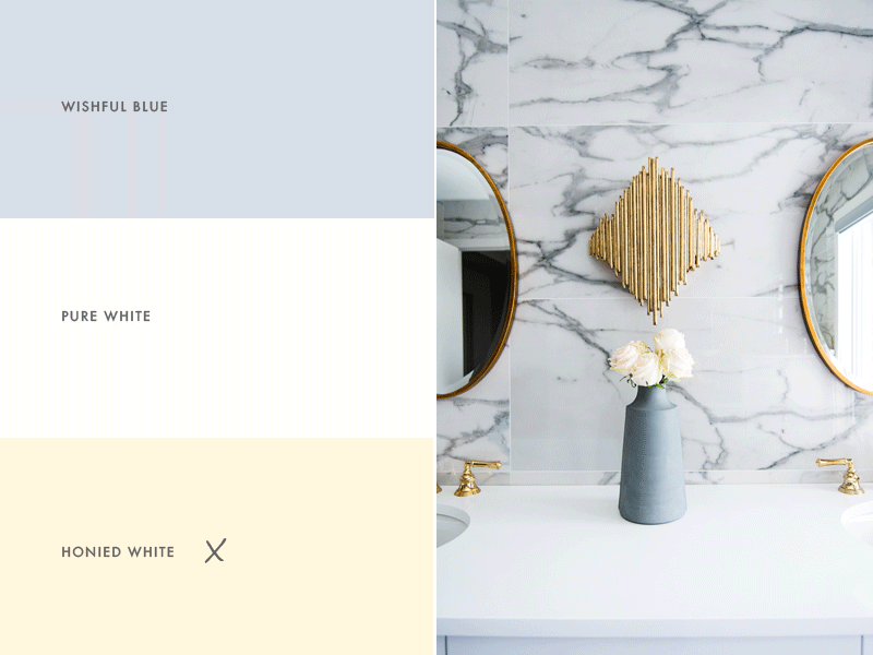
Plus I’ve added a complementary neutral white/cream for trim, upper cabinets or walls. Nothing sets off a beautiful deep shade like a perfect crisp clean light neutral. Trust me it makes all the difference.
Best Deep Rich Kitchen Cabinet Colors
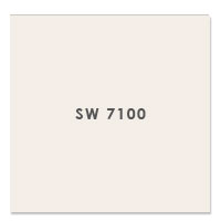
SW 2819 Downing Slate + SW 7100 Arcade White
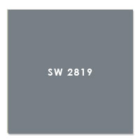
A deep saturated gray with a blue undertone, Downing Slate is clearly a winner for any kitchen that features a Carrara marble counter or backsplash for example.
In fact I think that combo would be gorgeous.I love the contrast of a light countertop like marble, soapstone or granite with this rich color.
You could also have fun with coordinated wallpaper in a small washroom off the kitchen or in a study or den. I’ll drop some prints below. Arcade White is a creamy shade that balances the dark gray “slate”. Use it on upper cabinets, trim or doors.
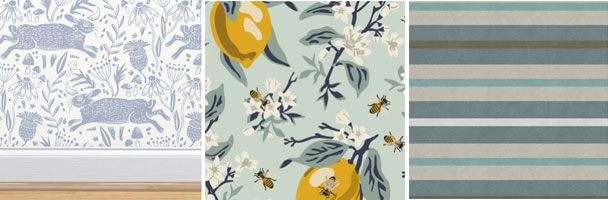
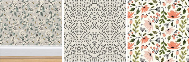
Wallpaper and fabrics to pair with Downing Slate- Images @Spoonflower
SW 9574 Hulett Ore + SW7102 White Flour

A deep saturated gray but this time with a brown undertone which keeps it warm, Hulett Ore is a lighter version of the Color the Month, Iron Ore.
This tone plays well with farmhouse, modern, contemporary or even rustic. It all depends on what you put with it. Once again I suggest a crisp light contrasting color for walls and even upper cabinets if you want to keep the light bouncing around a small room.
I could see this color on a wainscot – that’s those half walls of paneling or paint – with a wallpaper above. It really depends on what style you’re going for. I’ll drop a wallpaper below in the prints.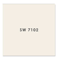
Wallpaper and fabrics to pair with Hulett Ore- Images @Spoonflower
SW 6208 Pewter Green + SW 7001 Marshmallow

Pewter Green is a rich deep dark foresty green with brown undertones. Don’t forget a big dose of creamy white “Marshmallow” on the walls to offset all this drama.
I suggest light or dark countertops in marble, granite or soapstone. Let’s use hardware in bronze or gold to warm it up further and make it feel luxurious.
I see this color palette working well in country, traditional, farmhouse, rustic or cottage style homes. With Pewter Green on a kitchen island or base cabinets, you could get away with wood cabinets above.
These prints I’ve dropped below include a massively masculine plaid wallpaper, and two subtle monochrome patterns.
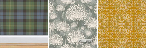
Wallpaper and fabrics to pair with Pewter Green- Images @Spoonflower
What Paint Finish Should You Use?
I suggest a satin finish or semi gloss finish on cabinets and trim, with satin or velvet finish on walls. Matte finishes are usually less expensive, but I rarely use them.
A flat or matte finish can be a pain to keep clean because it shows every single fingerprint and mark. Do yourself a favor and pick a finish with some sheen like Satin especially on areas that get high use like a kitchen or bathroom. It’s easier to clean plus it lets light bounce and reflect around the room. Win!
Using Your Color Throughout
Choose a color palette or scheme as the first step to design your space. A curated group of colors that work well together is what I preach. Using consistent colors throughout your home will make it feel calmer, more pulled together and intentional – like you know what you’re doing!
You can still use other colors of course. Pick some accent colors to use in accessories, furniture and flooring. But keep 2-4 colors as your main go to shades for each room.
- Your color palettes can help you choose paint for walls, but also other wall and flooring finishes. Not sure about the tone in a rug sample? Hold it up to the paint swatch in natural light.
- Use your paint swatches to pick tile backsplash and bathroom tile too. It doesn’t have to match but it should be in the same hue or tint.
- Your color palette can help when choosing the right color for a sofa or chair.
- The same’s true for deciding on curtains or window treatments. Each time you repeat these colors, whether as a solid (painted wall), a texture (flooring) or a pattern (fabric) you’re making this color thing work!
As an easy decision maker when making choices about what to buy, what to keep or what to get rid of in your home, you can’t go wrong with using your palette.
Still not sure what color is right? Learn more about a quick affordable solution, my Color Clarity service.


No Comments