
What colors go with SW 6523 Denim?
SW 6523 is a mid range blue that evokes the color of a well worn pair of jeans. Denim is one of Pottery Barn’s fall/winter colors for 2021 and I consider it a versatile neutral.
Blues can be warm or cool depending on their undertone.
See a blue with yellow/green tones in it? That’s a warm blue.
A blue that leans towards reddish/purply undertone is a cool blue.
A blue can also be neutral. That’s where Denim falls. It’s a cool neutral blue that’s easy to pair with many other colors.
– Sherwin Williams refers to it as a purple tone but Green and Black predominate which is true for neutrals.
If you’ve been asking yourself what color works with the new soft pink colors, Denim may be just the color you’ve been looking for. It makes pink tones less girly and gives a much needed definition to any neutral palette. Plus just like the fabric, it really goes with almost anything!

SW 6523 Denim Color Values
- RGB: 80, 107, 132,
- HEX: #506b84
- LRV: 14
I’ve pulled together two coordinating color schemes to help you make the most of Denim.
SW 6523 Denim can be used to paint doors/trim, cabinets or walls. I’d suggest using a semi gloss or gloss finish on cabinets and trim, with satin or velvet finish on walls.
I’m not a fan of matte finishes even though they’re usually cheaper. Flat or matte finish is a nightmare to keep clean and shows every single fingerprint and mark especially with a darker color. Do yourself a favor and pick a finish with some sheen like Satin. It’s easier to clean and helps light bounce off the paint color and reflect around the room.
Cool Palette: Modern, Scandi, Farmhouse

- SW 2653 Denim
- SW 7103 Whitetail
- SW 7516 Drift of Mist
- SW 2844 Roycroft Mist Gray
Denim can be used for walls, cabinets and trim, but Denim is an accent color and is best when paired with warm neutral colors.
Whitetail is a creamy white that keeps everything feeling fresh and light. Use SW 7103 to paint trim, doors, cabinets and walls.
Drift of Mist is one step darker than Whitetail. It’s a warm gray that’s perfect to use throughout the house as your “base” color. I’d use this one color on your trim, doors and walls especially if you have shiplap, wainscotting or panel details. Use just one neutral color on both trim and walls for a modern vibe that’s easier to paint!
Roycroft Mist Gray is a warm soft gray to use in a bedroom, bathroom, study or on cabinets or built-in bookcases.
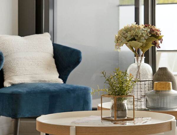
COLOR TIP: Take these paint swatches with you when picking fabrics, wallcovering, tile and upholstery. A chair could be upholstered in “denim” fabric or pillows. Use “Denim” throws, blankets and accents like pottery, lamps and vases help pull your color palette throughout the house. Rugs, tile and floor coverings are another way to add “denim” to a room.
Shop your color palette!
Neutral Palette: Grandmillenial, Retro, Feminine

- SW 2653 Denim
- SW 7106 Whitetail
- SW 6329 Faint Coral
- SW 6057 Malted Milk
Denim is really a neutral in disguise. For this color palette let’s use the classic pairing of blue with pink/rose. Is this is too feminine? No because “Denim” keeps it from being too sweet. Pink is having a moment and it’s such a flattering color to live with!
These shades aren’t cool girlie pinks, think of them more like warm skin tones .
Whitetail is perfect for your trim, doors, bookcases and cabinets.
Faint Coral is ideal for walls, inside bookcases or shelves, cabinetry in bathrooms, bathrooms and powder rooms.
Malted Milk will work well to tone down any pink in a room and it pairs well with Denim. Use SW6057 on cabinets, doors, walls or anywhere you want a soft warm color.
Want to add a deeper tones to this palette?
A warm Sand or Tan like Macadamia will also work with this color palette.
If you already have a tan sofa or wood floors, use one of these colors to freshen up those tans or browns.
Here’s what to shop for to bring your color palette “home”!
How to Use a Color Scheme
Choosing a color palette or scheme is the first step in designing any space. Using consistent colors throughout your home makes it feel calmer, more pulled together and intentional.
Does this mean you can’t use any other colors? Of course not! But use these color palettes for the big color choices if you want your home to feel “done”.
- I suggest these paint colors for your walls, but use them to pick other wall and flooring finishes like rugs and tile.
- Not sure about the tone in a rug sample? Hold it up to the paint swatch and look at it in natural light.
- Use your paint swatches to pick tile backsplash and bathroom tile. It doesn’t have to match but it should be in the same hue or tint. Take both tile and paint sample outside or in a window with filtered natural light and compare.
- Use your color palette to choose the color of any large piece of furniture like a sofa or curtains or window treatments.
Also use your palette to help you make those tough choices about what to buy, what to keep or what to get rid of in your home.


No Comments