Use this SW 7016 Mindful Gray coordinating color scheme for your entire home!
Mindful Gray by Sherwin Williams is one of their best selling neutrals. It’s a slightly darker and deeper shade than Agreeable Gray, the most popular neutral gray.
While Agreeable Gray has a very slight reddish tone to it, Mindful Gray has more of a more yellow tint. Because the red and yellow in both are so subtle, it means they’re both neutral grays – not warm or cold.
Mindful Gray or Agreeable Gray?
If Agreeable Gray feels too safe and not enough color, Mindful Gray is just that bit deeper, warmer and richer. It’s the kind of gray that will make white trim pop and hold its own against dark wood flooring.

- SW 7016
- R:188 G:83 B:173
- Hex Value:#bcb7ad
- LRV:48
Trends are leaning towards safe and cozy and away from cold tones. We want our living spaces to feel warm and secure these days! So a soft neutral gray is still a solid color choice to anchor your home’s color palette. When you add in other light and dark contrasting colors you keep a “gray room” from feeling dark, drab or dull.
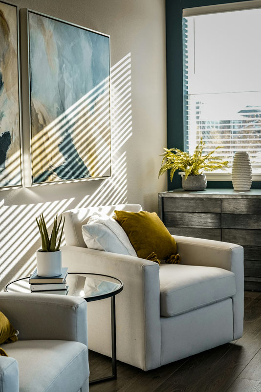
Using these colors throughout your home makes for a coordinated feel and helps your home “flow”. It’s a piece of cake to pick up the blue and gold colors here in your accessories and fabrics.That’s a great way to keep the color moving throughout the house.
Don’t forget to use these colors in the patterns and textures you use to accessorize. Furniture too! That’s how you get a model home look.
Let’s go – here’s the best accent colors to use with Mindful Gray!
SW 7016 Mindful Gray Color Scheme
 SW 7004 Snowbound
Snowbound white is ideal for your trim, doors, kitchen and bathroom cabinets. This soft neutral white would also work well on the walls of a nursery, bathroom or where you want to keep light and airy.
Don’t be afraid to mix things up a little. A nice swap would be to paint the walls in Snowbound and the trim in Mindful Gray. Using a slightly darker trim to wall color can work well in a traditional, farmhouse, cottage or classic home.
The more you use Snowbound liberally around the house the lighter your home will feel. If you’re going for a darker dramatic vibe then by all means cut back on SW 7004 Snowbound and feature more Mindful Gray. I believe the right white is the key to making a color scheme work.
 SW 6400 Lucent Yellow
Lucent Yellow is the perfect coord color to warm up Mindful Gray. Use it to get a brighter softer feel. For example this sunny color is ideal for a nursery, bedroom or even a dark or north facing kitchen.
SW 6400 is a great choice in a laundry or utility room to keep it cheerful and warm. Don’t underestimate how small doses of a warm soft color like Lucent Yellow can lift darker colors and add brightness and warm to an otherwise neutral palette.
Try painting furniture in Lucent Yellow for a soft pop of color against Mindful Gray or Inky Blue. This soft yellow on fabric, bedding or accent chair seats is another way of stretching your color palette.
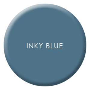 SW 9149 Inky Blue
For a shot of vibrancy, Inky Blue coordinates well with Mindful Gray adding much needed contrast. Most grays can seem dull without a spark of true color for distinction.
Because SW 9149 is an intense color, use it sparingly. What about on an accent wall with Snowbound as the main color or as the main wall color in a study or powder room?
For a bold treatment, try painting doors and trim in Inky Blue along with walls.
Kitchen or bath cabinets is another way to use this intense blue. If you like the maximalist look or feel happy with deep colors, don’t be afraid to experiment.
Reach for these coordinating colors for Mindful Gray if you want your home to feel coastal, cottage or farmhouse style, although these timeless shades will work in most homes.
Where to Use Mindful Gray Coordinating Colors
- SW 7016 Mindful Gray – gray; walls, trim, cabinets, doors
- SW 9149 Inky Blue – soft deep blue; accent wall, room, cabinets
- SW 7004 Snowbound – white; trim, cabinets, doors
- SW 6400 Lucent Yellow – gold; walls, cabinets
What Paint Finish Should I Use?
SW 7016 Mindful Gray can be used on your walls, cabinets or trim, it’s that versatile. I’d suggest using a semi gloss or gloss finish on cabinets and trim, with satin or velvet finish on walls.
I’m not a fan of matte finishes even though they’re usually cheaper.
Flat or matte finish is a nightmare to keep clean and shows every single fingerprint and mark. Do yourself a favor and pick a finish with some sheen like Satin. It’s easier to clean and lets light reflect around the room. Win win!
Using a Color Palette Throughout Your Home
Choosing a color palette or scheme is the first step and using consistent colors throughout makes your home feel calmer, more pulled together and intentional.
This color scheme is not only for your walls, but use it to pick other finishes like rugs and tile.
Use your paint swatches to pick tile backsplash and bathroom tile. It doesn’t have to match but it should be in the same hue or tint. You don’t have to worry about what that means, just do the natural light test. Take both tile and paint sample outside or in a window with filtered natural light and compare.
Your color scheme is also a guide to help you pick the color of furniture, curtains or window treatments. Every time you repeat these colors, whether as a solid (painted wall), a texture (flooring) or a pattern (fabric) you’re making this color thing work!
Keep your swatches handy to make tough choices about what to buy, keep or what get rid of in your home.


No Comments